By continuing to use the site, you agree to our use of cookies and to abide by our Terms and Conditions. We in turn value your personal details in accordance with our Privacy Policy.
Please log in or register. Registered visitors get fewer ads.
Bit disappointing really…. on 11:35 - Oct 16 by Illinoisblue
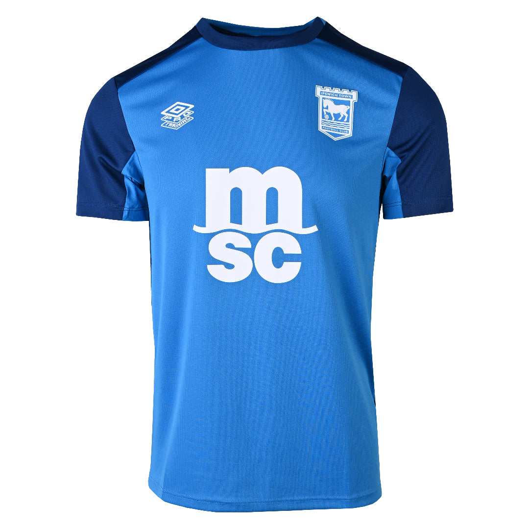
Correct. The HALO font is way too big. And imagine the proper badge in gold along with some gold trim on the sleeves and collar. Would have banged hard.
I’ll probably still buy cos fans and their money are easily parted.
Just said the exact same thing to a mate at work - smaller HALO logo, full badge in gold and with a tiny bit of gold trim on the sleeves etc, and that would've been an absolute masterpiece.
Love what the guys have done. Would have maybe liked a gold collar and trim but still a great shirt. Shame the Premier League don’t allow gold names and numbers.
I see that the club font comes with a gold name/number set. It's just a shame that the italic nature of the font makes it look off-centre.
Not a prophet, or a stone-age man; just a mortal with potential of a superman.
Bit disappointing really…. on 11:35 - Oct 16 by Illinoisblue
Correct. The HALO font is way too big. And imagine the proper badge in gold along with some gold trim on the sleeves and collar. Would have banged hard.
I’ll probably still buy cos fans and their money are easily parted.
The HALO logo doesn't look any different in size to those on the home and away shirts, is it?
Not even close to the previous blackout one, but not bad, other than the logo of course, but then you could say that about any football shirt!
The badge is also a huge no for me, I guess we will make the change eventually like all other club badges, but I am old fashioned traditionalist!
I dislike it when clubs wear different club badges on different shirts. That never used to happen, but suddenly many clubs are doing it. When they combine this with shirts of a colour nothing to do with the club traditions, and with three or four different shirts in one season, the teams lose their identity in my opinion. I want to see Ipswich play in blue and white whenever possible, with the proper club badge.
I dislike it when clubs wear different club badges on different shirts. That never used to happen, but suddenly many clubs are doing it. When they combine this with shirts of a colour nothing to do with the club traditions, and with three or four different shirts in one season, the teams lose their identity in my opinion. I want to see Ipswich play in blue and white whenever possible, with the proper club badge.
I’m the same… don’t like this current trend that lots of clubs are doing with the part badge on the kits.
Another thing I’ve noticed, and not sure why or when, but a change to the design of the badge when used white out.
On the paper bags from planet blue, and a lot of merch, it is presented like this…
Today I noticed that the Arsenal goalkeeper wore a different version of the badge to the outfield players. It gets more and more silly in my opinion. Have one badge and stick to it.

 By continuing to use the site, you agree to our use of cookies and to abide by our Terms and Conditions.