Please log in or register. Registered visitors get fewer ads.
Town Launch Third Kit
Friday, 16th Oct 2026 10:07

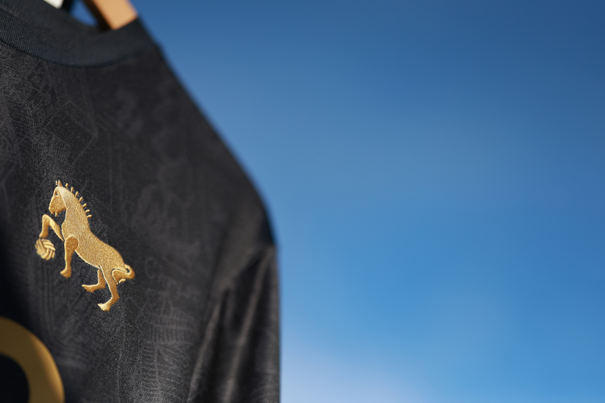
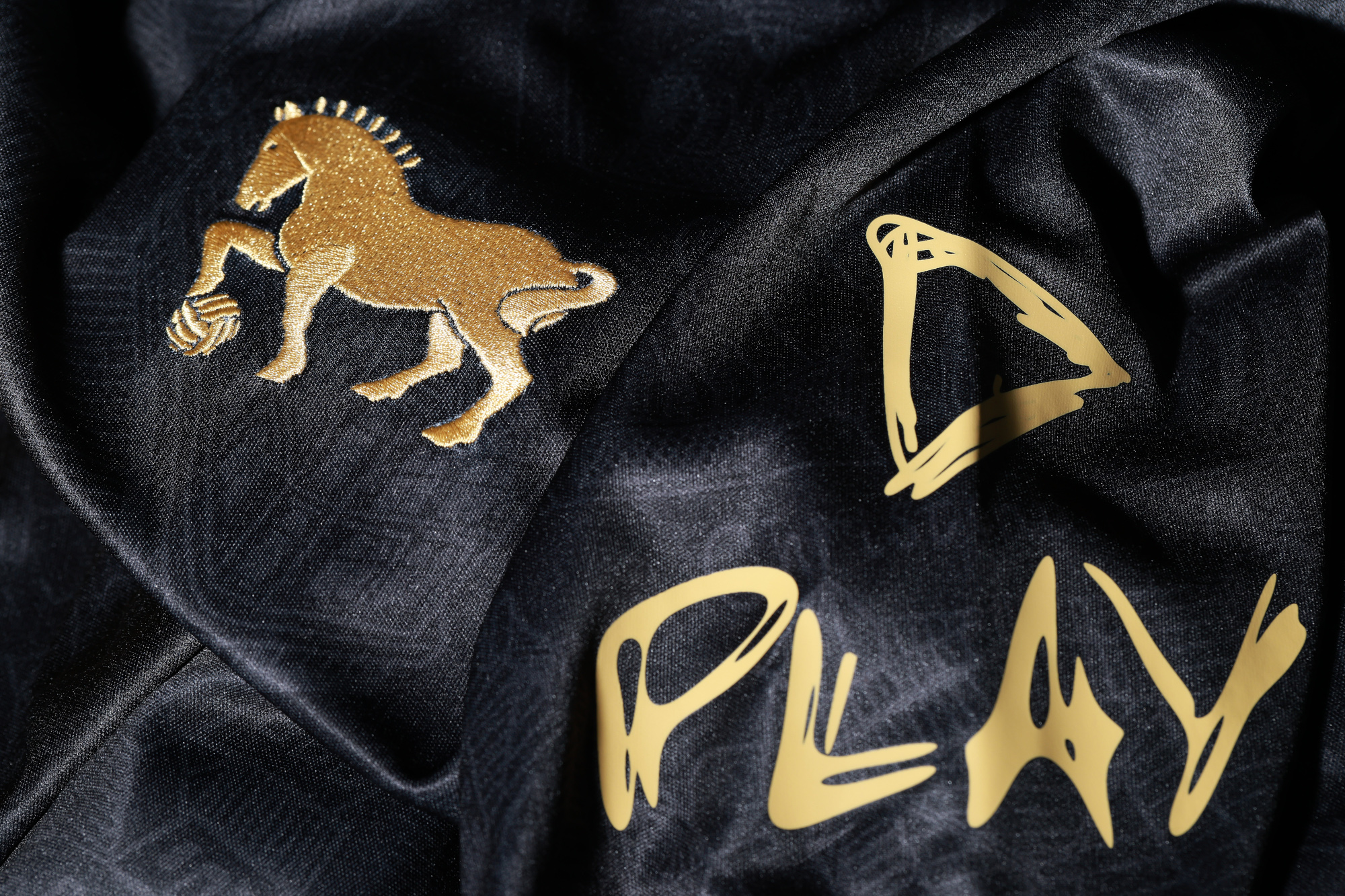
Town have launched this season’s third kit ahead of tomorrow’s trip to Manchester City, which is available for pre-order only now.

The black and gold design has been created with Call Me Ted, the fan-led art collective behind the bespoke match posters over the last few seasons.

The new kit features Call Me Ted’s Tudor-style map of Ipswich which was used on the limited edition white warm-up shirts for the Millwall game earlier in the year, which raised more than £15,000 for the Ipswich Town Foundation.

Maintaining that link, £1 from every third shirt sold will be donated to the Foundation.

The map features landmarks, including the Cornhill, the waterfront, Christchurch Mansion, the Buttermarket, Wolsey’s Gate and Portman Road, covering the entirety of the shirt in subtle grey with Call Me Ted referenced inside the collar.

In addition, Ed Sheeran is depicted within the design, as well as a number of the Ipswich businesses with associations with the club and matchdays at Portman Road.

The black shirt features the badge and sponsors’ logos in gold, and is augmented by black shorts and socks.

“We are excited to launch this season’s third shirt in collaboration with Call Me Ted, which celebrates the town of Ipswich,” CEO and chairman Mark Ashton said.

“We know how popular the previous design was with Ipswich Town fans and I know this reimagined version will be incredibly popular, while also supporting the vital work of the Ipswich Town Foundation.”

Richard and Steve Haugh of Call Me Ted added: “As a fan collective, we’re excited to collaborate with the club on a Premier League shirt that reflects how much football and creativity mean to our community, while also supporting the incredible work of the Ipswich Town Foundation.

"The map design tells the story of Ipswich's ambition, linking Thomas Wolsey’s Tudor vision for the town with the energy of today, fuelled by the club’s success. It’s a celebration of our town and the creative talent within it, and we couldn’t be more proud of how it turned out.”

Foundation CEO Dan Palfrey said: “The collaboration with Call Me Ted raised a significant amount of money around our fixture with Millwall earlier this year and we are excited to be continuing this relationship through the club’s new third shirt.

“The money raised from sales will go towards our Beyond Labels provision, which provides opportunities to adults and children living with disabilities. This year alone, we have launched a new Deaf and Hearing Loss Football session along with You Can - a programme that provides those with additional needs and SEN with the knowledge, skills and confidence to be work-ready.”

The new third shirt is available for pre-order only with the window closing at 5pm on Saturday 31st October. Pre-orders will begin to be dispatched at the end of October with general sale beginning at Planet Blue on Friday 6th November.

Shirt personalisation is available in either the white Premier League font or in a gold version of the Town font.

Men’s shirts are available in sizes small-5XL, with women’s sizing ranging from 8-20. A full range of youth sizing is on offer from small to XL, along with infant kits ranging from 2-3 up to 6-7.


Photo: ITFC/Matchday Images



Please report offensive, libellous or inappropriate posts by using the links provided.


TownSupporter added 10:09 - Oct 16
Looks decent.

One question, why is the Halo logo so high on the shirt?

It's all a bit squashed.
2

mathiemagic added 10:18 - Oct 16
God, the video on the official website wins the cringworthy video of the year award hands down !
3

Wallingford_Boy added 10:20 - Oct 16
That's where sponsor's logos go, where do you want it? Around the waist?!
0

ashp19 added 10:20 - Oct 16
love the detail, love the collab and good for the foundation - great vision by all. I've always felt the Halo logo would look better scaled down a touch across all shirts.
6

carlo88 added 10:23 - Oct 16
The club crest should be the club crest, not some abbreviated form of it. And in the correct colour. World's gone mad I tell you.
-1

Jugsy added 10:24 - Oct 16
I love these shirts. I'm far less fussed on home shirts, there's only so far a blue and white shirt design can go, but these creative third kits are brilliant. It provides creative freedom, love it.
3

guentchev123 added 10:25 - Oct 16
Absolutely love the shirt. I know it’s probably the last year of the Umbro deal but the benefit of partnering with them rather than Adidas, Nike, Puma etc is they will do these bespoke designs that you simply wouldn’t get with the bigger partners. Love the map detail which will no doubt be much better when you see the shirt for real. The club have made a real conscious effort to create buy in to the whole Ipswich / Suffolk “brand” and this shirt is another example. Working with Call Me Ted, staging Fabio’ fights, Ed Sheeran’s sponsorship and gigs and even this release video add to this. Well done to all involved.
6

benslifeyt added 10:26 - Oct 16
TAKE MY MONEY !!!
3

wolfyattheback added 10:39 - Oct 16
doesn't need the map on it and the obsession with Ed Sheeran has got to stop!
-8

Monkey_Blue added 10:55 - Oct 16
Palascios looks delighted to be doing a night shoot
0

OliveR16 added 10:56 - Oct 16
wolfyattheback 'the obsession with Ed Sheeran has got to stop!' It's all good. What must stop, surely, is reference to unused Coventry squad players in usernames on this site . . .
5

Steelmonkey added 11:01 - Oct 16
It looks to be a blue iridescent and gold in some of the photos much better then the black and gold imo.
-1

flykickingbybgunn added 11:32 - Oct 16
Yes, is it black or is it navy ?
1

Suffolk_n_Proud added 11:33 - Oct 16
This will be controversial but I prefer the Suffolk Punch alone as a club crest over our current one, and it's not as if I'm a new younger fan, I've been going to games since the early 90s.
1

trueblue85 added 12:08 - Oct 16
I never like to be negative regarding ITFC, but, after the build up, this is massively underwhelming in my opinion. The colours are fine, but why are recent designs from Umbro so damn lazy? Is it their design team? Our side? A combo? I just feel comparing it with other designs out there, this is so lazy. They could of at least given the design an actual decent collar!
Anyway, moan over. Of Town secure Prem status in this kit I won’t give a sh!t. Haha.
0

LandOfMickyStockwell added 12:11 - Oct 16
I like hearing the opinions on the sponsor logo size and position. Owners of an original replica 1989/92 home shirt will know all about replica kit logos. I was delighted and a bit peeved at the re-edition with a correctly sized Fisons. I still wear my original, but will definitely be adding this new third kit to my collection.
0

orfordbuoy added 12:42 - Oct 16
the massive blocky HALO letters ruin a smart shirt. The Suffolk Punch plays a bit-part role. Shame.
0

tetchris added 12:54 - Oct 16
Hopefully they’ll be a few left in end if season sale lol
1

RetroBlue added 13:00 - Oct 16
Er, its a black shirt with gold trimmings!
0

StowTractor added 13:00 - Oct 16
To those complaining about the Halo logo and the Ed Sheeran shirt sleeve badges : You do realise they pay to have their name or logo on our shirts? This is bringing revenue into the club, helping to buy and pay the quality of player we have, and need to keep, if we want to have a fighting chance of staying up.
1

SickParrot added 13:21 - Oct 16
I love it. The combination of black with gold always looks great and the subtle map detail detail makes it unique. It wouldn't work as well with the whole badge in my opinion.
0

algarvefan added 13:24 - Oct 16
Carlo88 who didn't have his weetabix for breakfast this morning!!!!
1

Broadbent23 added 13:33 - Oct 16
OK Nice shirt but the promotion of a third shirt is not ideal when every day living costs are increasing. Look at the new Ipswich Town Darts shirts they are cheaper and as a fan you will stand out in the crowd. All you need is an Ipswich Town badge to show your devotion.
1

Radlett_blue added 13:42 - Oct 16
Horrible and unnecessary. I fear we will be seeing this monstrosity more often than I want.
-1

benslifeyt added 15:00 - Oct 16
or the some saying they dont like the idea of 3rd shirts for money etc . vote with your wallet . dont buy it . i have bought one as i adore it :)
0


You need to login in order to post your comments

Blogs 300 bloggers

Ipswich Town Polls

About Us Contact Us Terms & Conditions Privacy Cookies Online Safety Advertising
© TWTD 1995-2026